The First Days of Spring: "Classic Routines" Launch
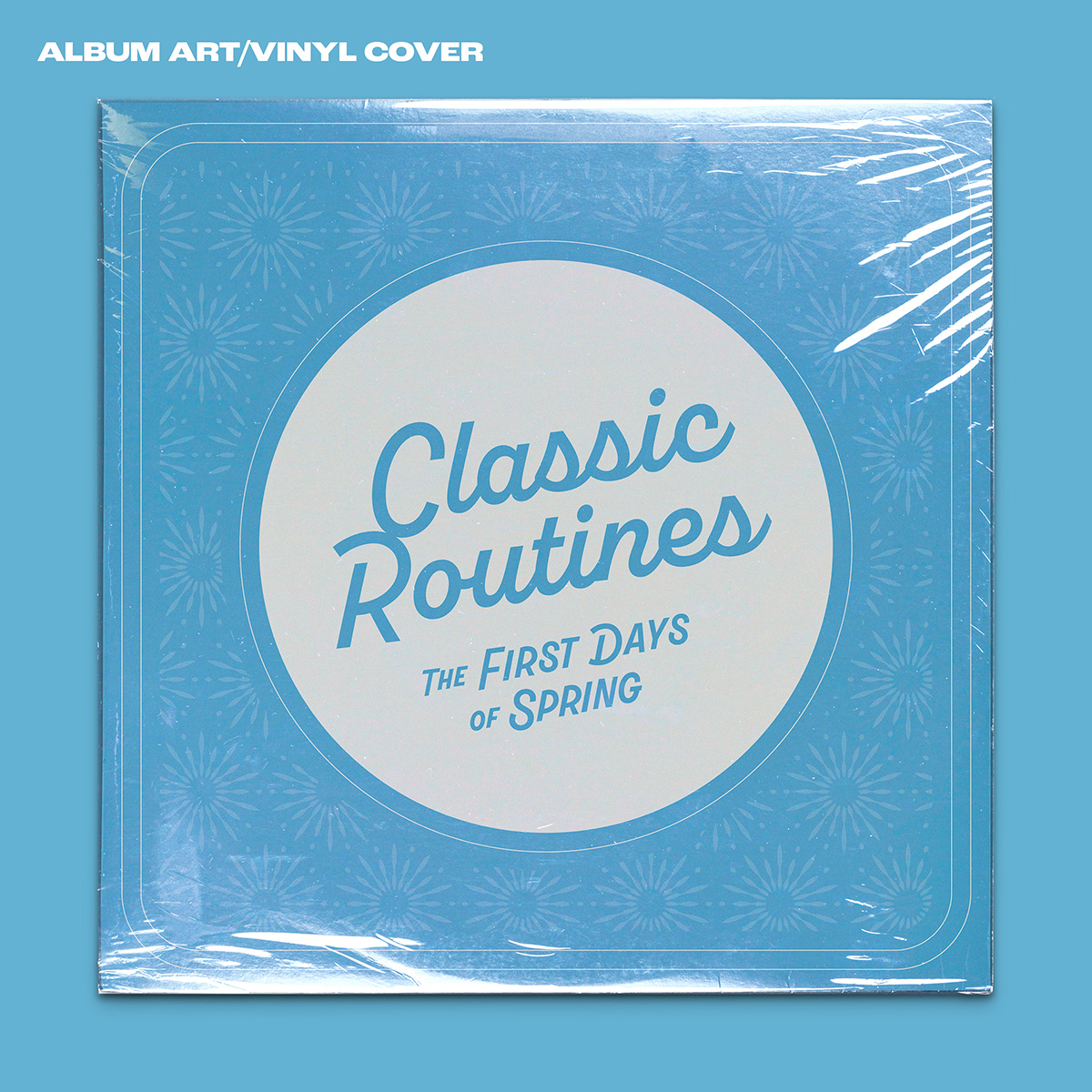
After I was provided with the rough draft of the album art, I was able to use it as reference for what the band was looking to accomplish, stylistically. I began by reinterpreting the art in a way that kept the original spirit of the design, but improved upon it. I worked in some new, but similar fonts, similar angled style, found a more vibrant blue, a new repeating background pattern, and a few other little tweaks to really pull it all together.
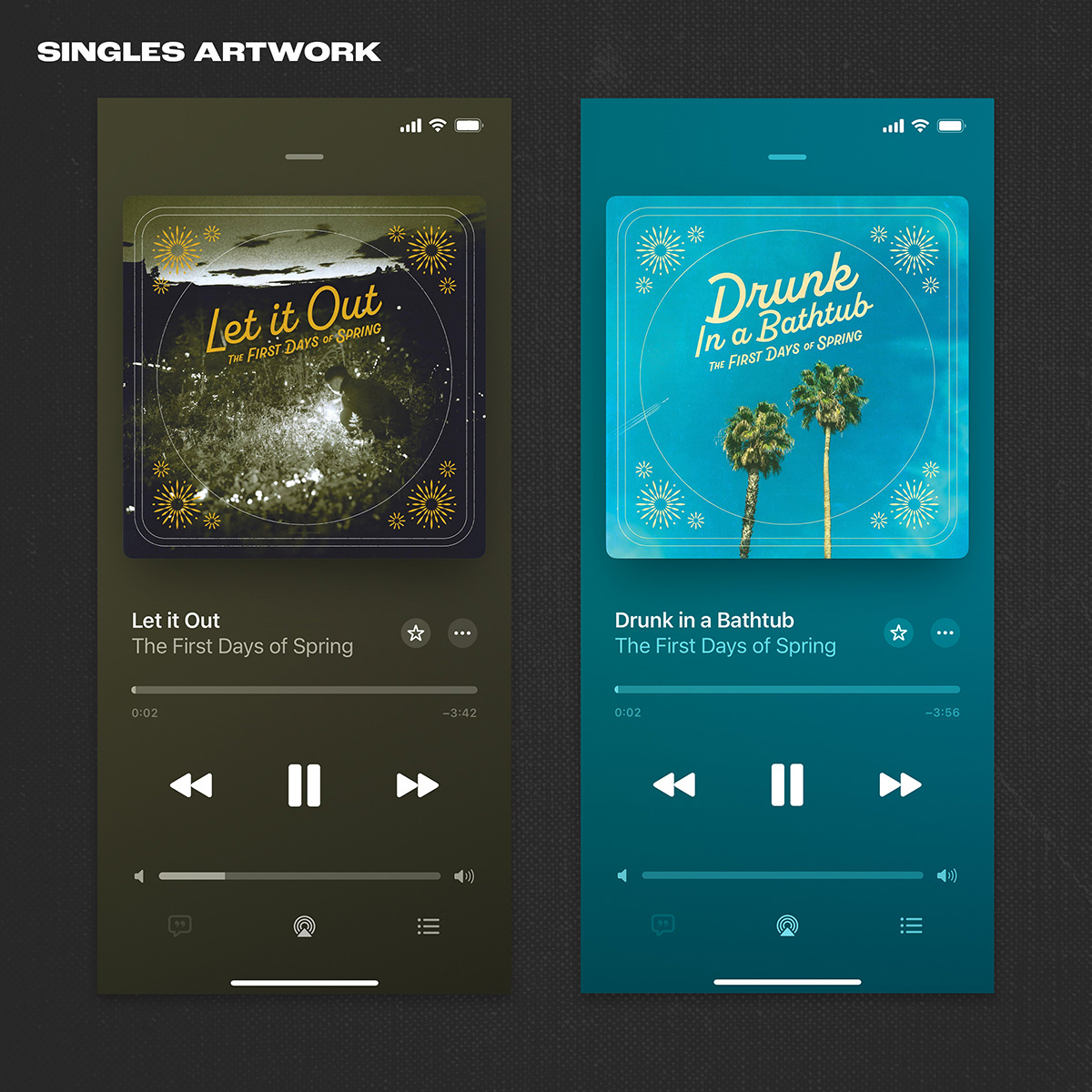
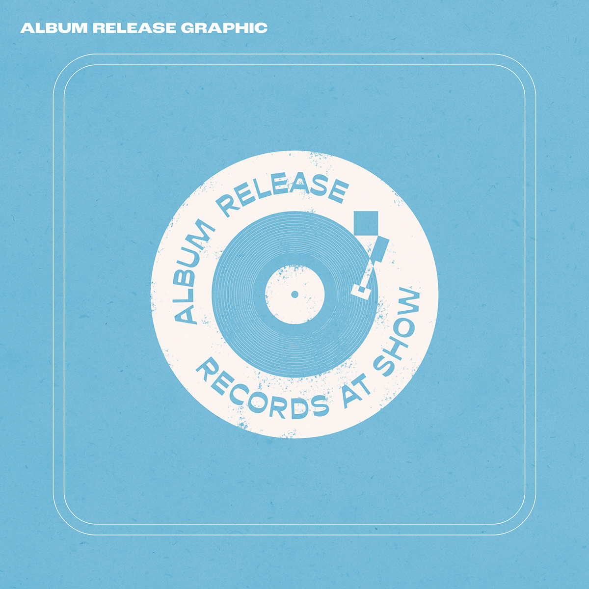
After designing the album art, I was asked to work on the cover art for two singles that were to be dropped before the official release. The art was to follow a similar theme/layout and feel cohesive. Each cover image for these reflect the single lyrics and overall mood. After these were designed, I was challenged to create poster for the album release show. After some initial experiments with the poster imagery and style, I ultimately landed on a collage style image of rabbits and nature slowly infiltrating a city. They typography and limited color palette was reflective of the album art.
After designing the album art, I was asked to work on the cover art for two singles that were to be dropped before the official release. The art was to follow a similar theme/layout and feel cohesive. Each cover image for these reflect the single lyrics and overall mood. After these were designed, I was challenged to create poster for the album release show. After some initial experiments with the poster imagery and style, I ultimately landed on a collage style image of rabbits and nature slowly infiltrating a city. They typography and limited color palette was reflective of the album art.


The First Days of Spring: Logo & Merch
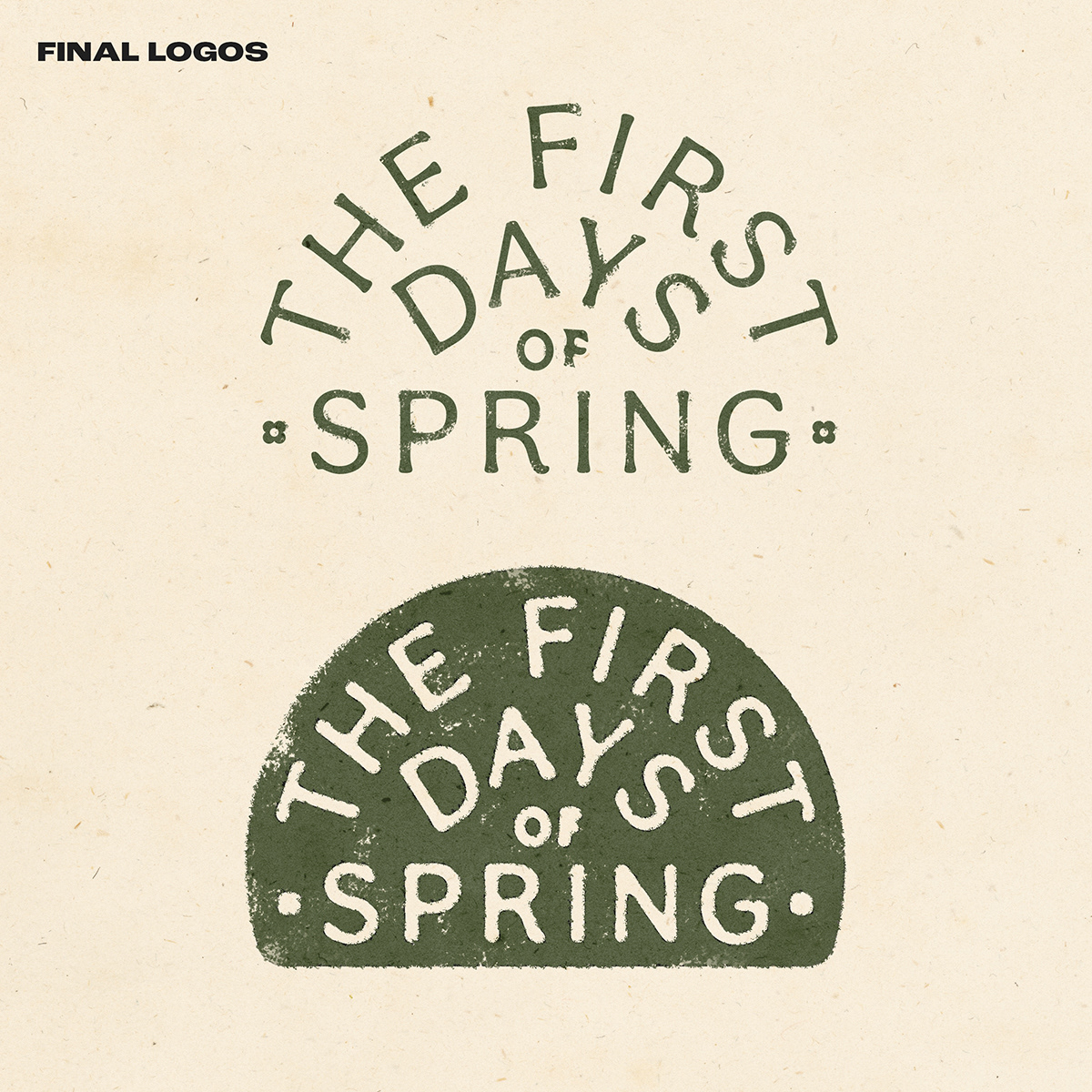
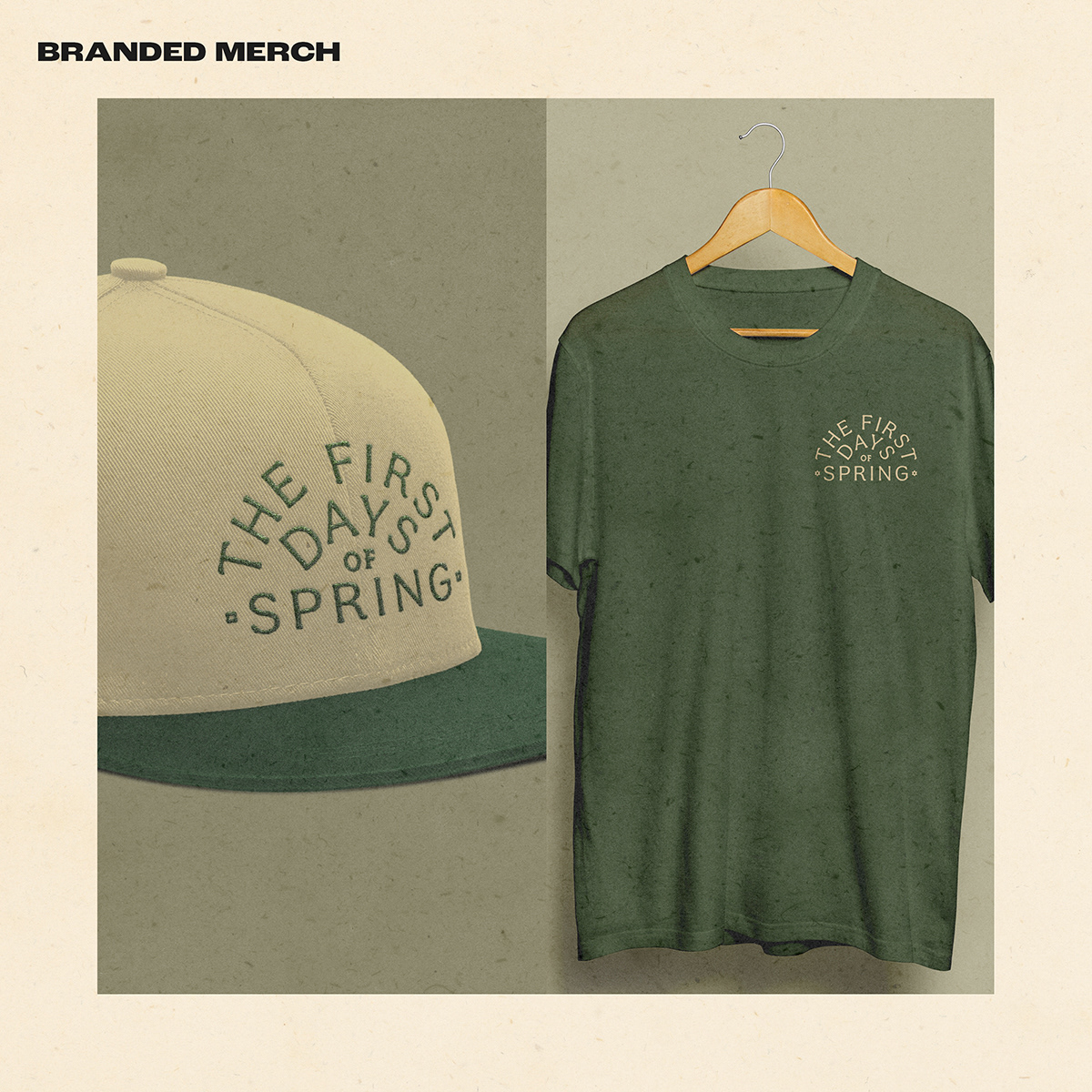
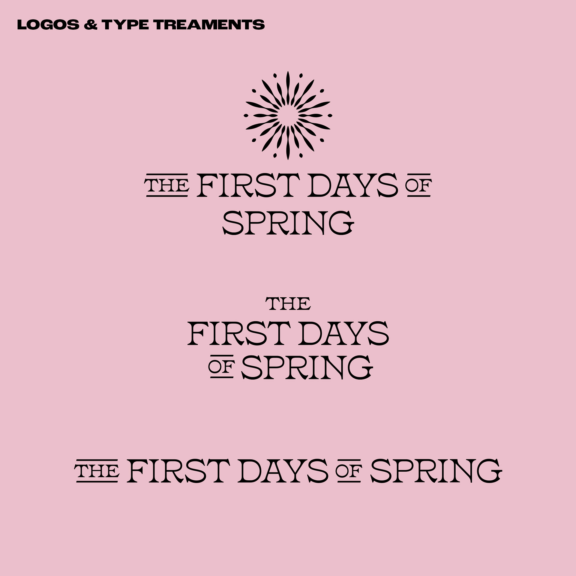
After the launch campaign for their sophomore album, Classic Routines, the band was in need of an updated logo for merchandise to sell at their shows and in their online shop. The logo took a simple arched typographic approach that felt light and organic. To help balnce out the logo when placed in a circular container, an open flower is added to the base to complete the shape.


The First Days of Spring: "Growing Better" Launch
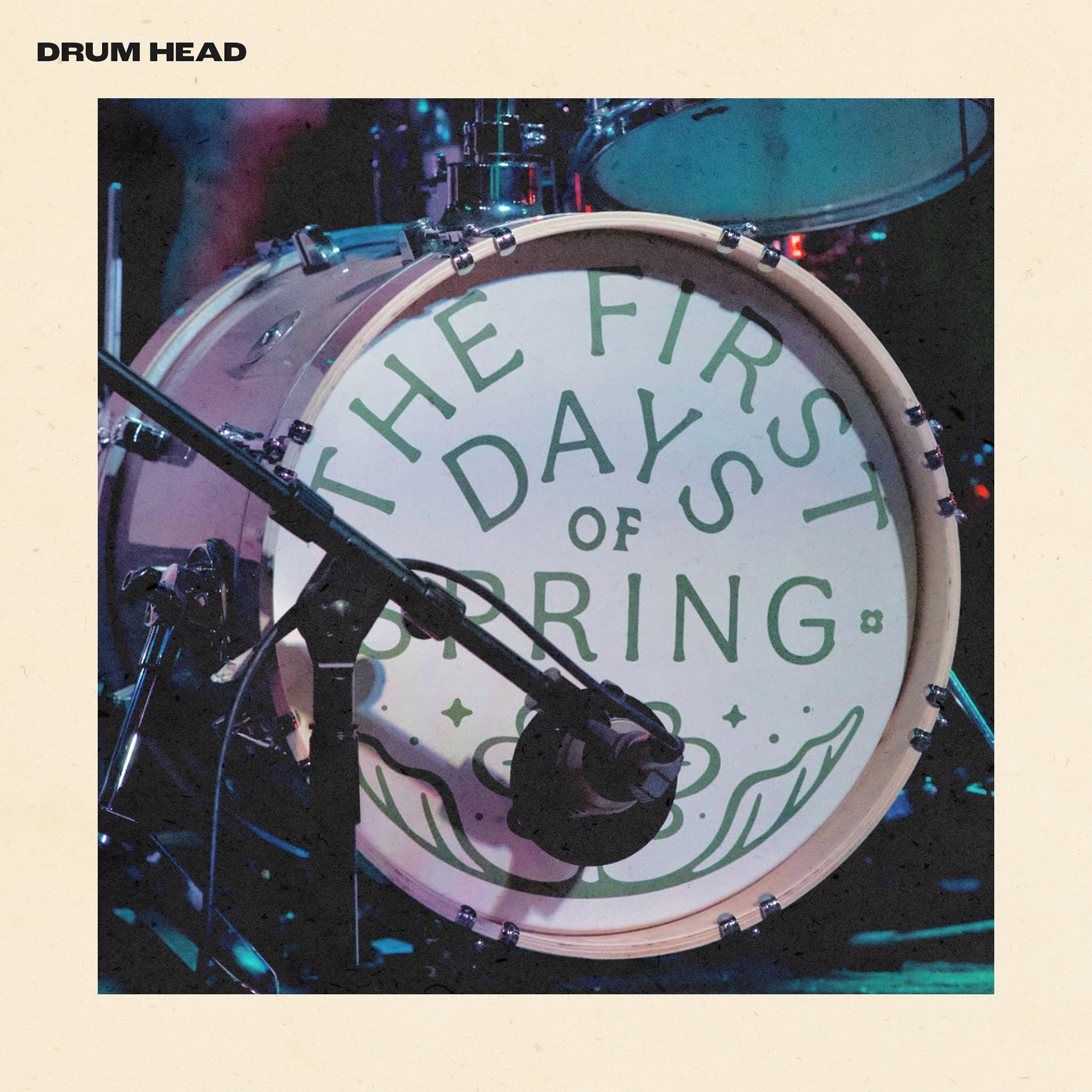
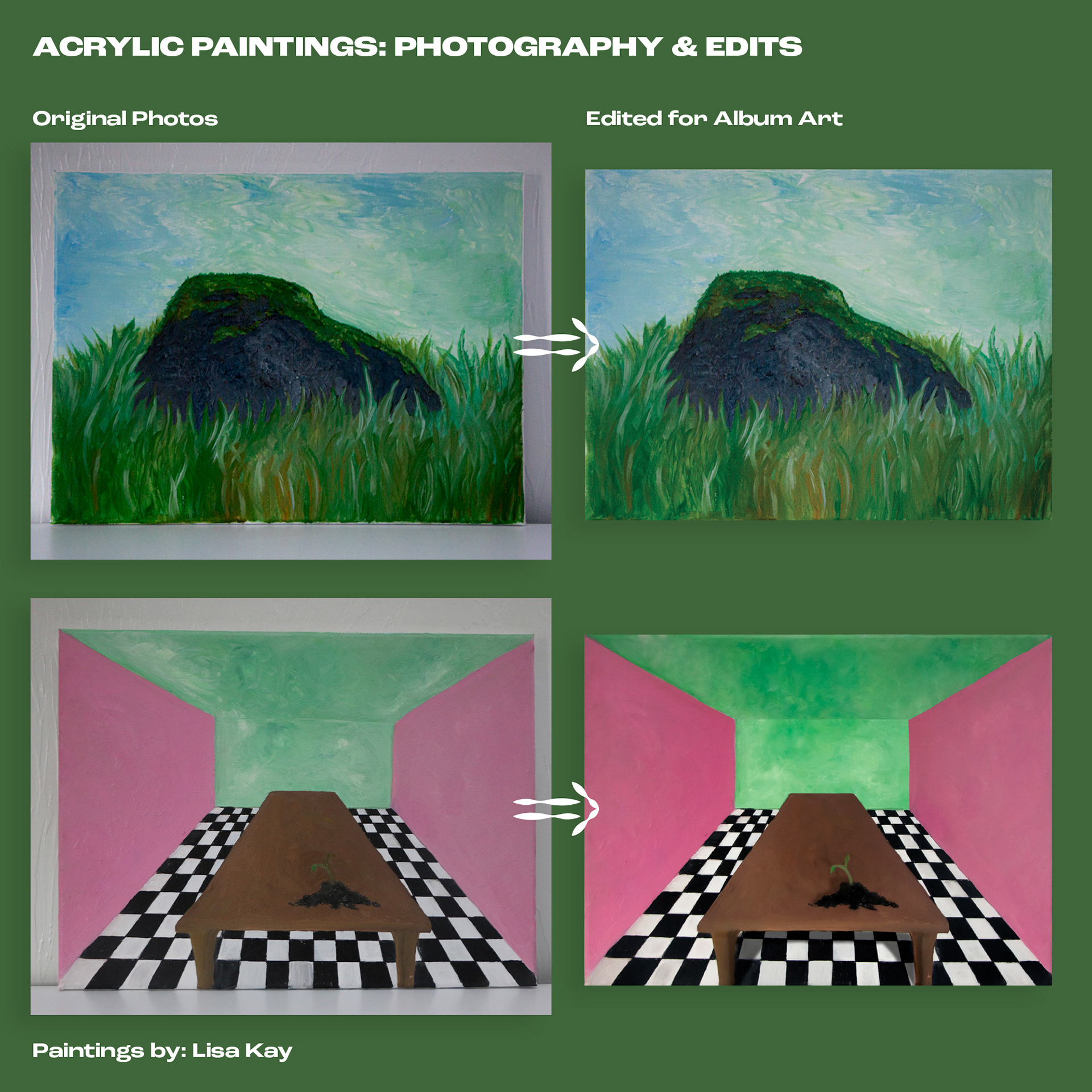
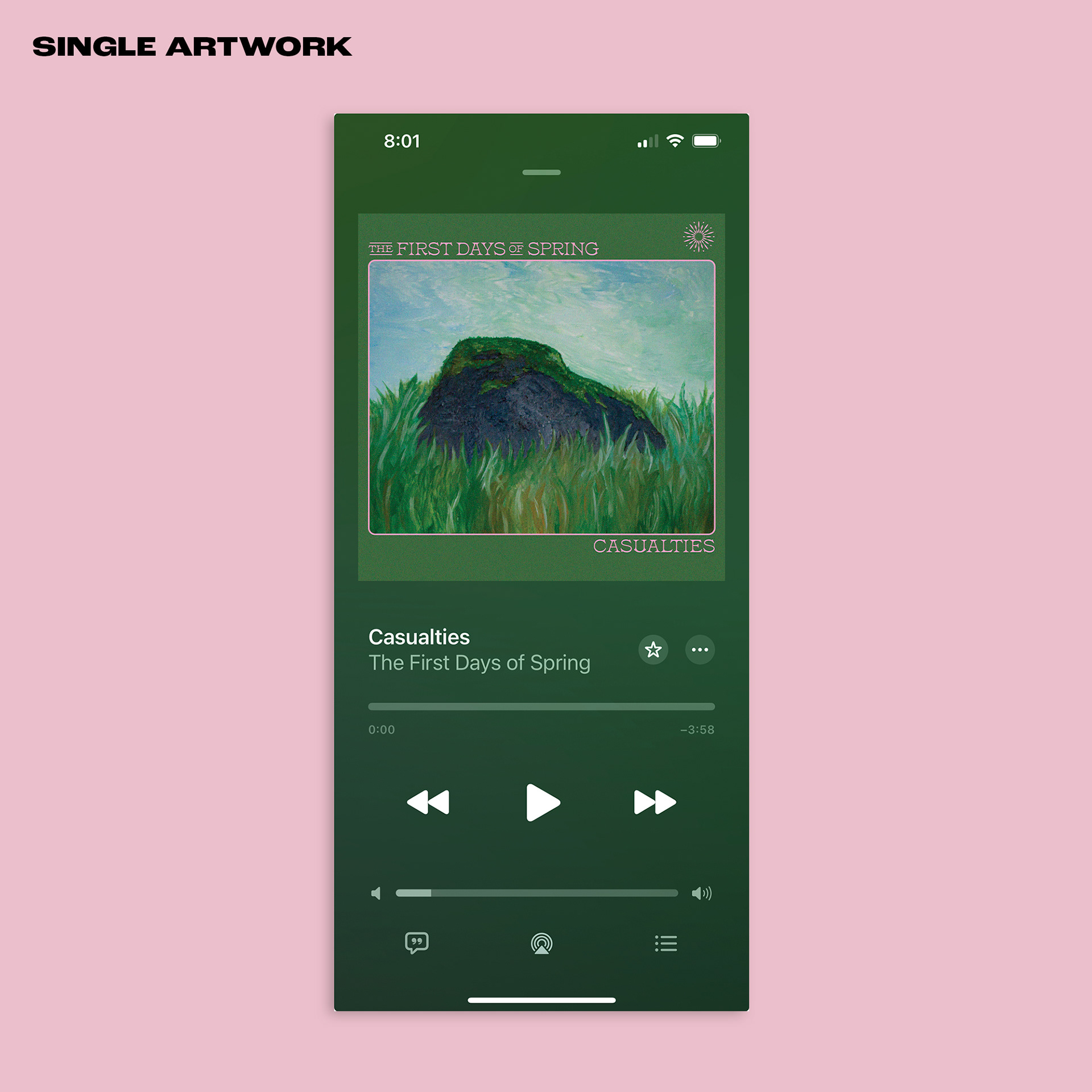
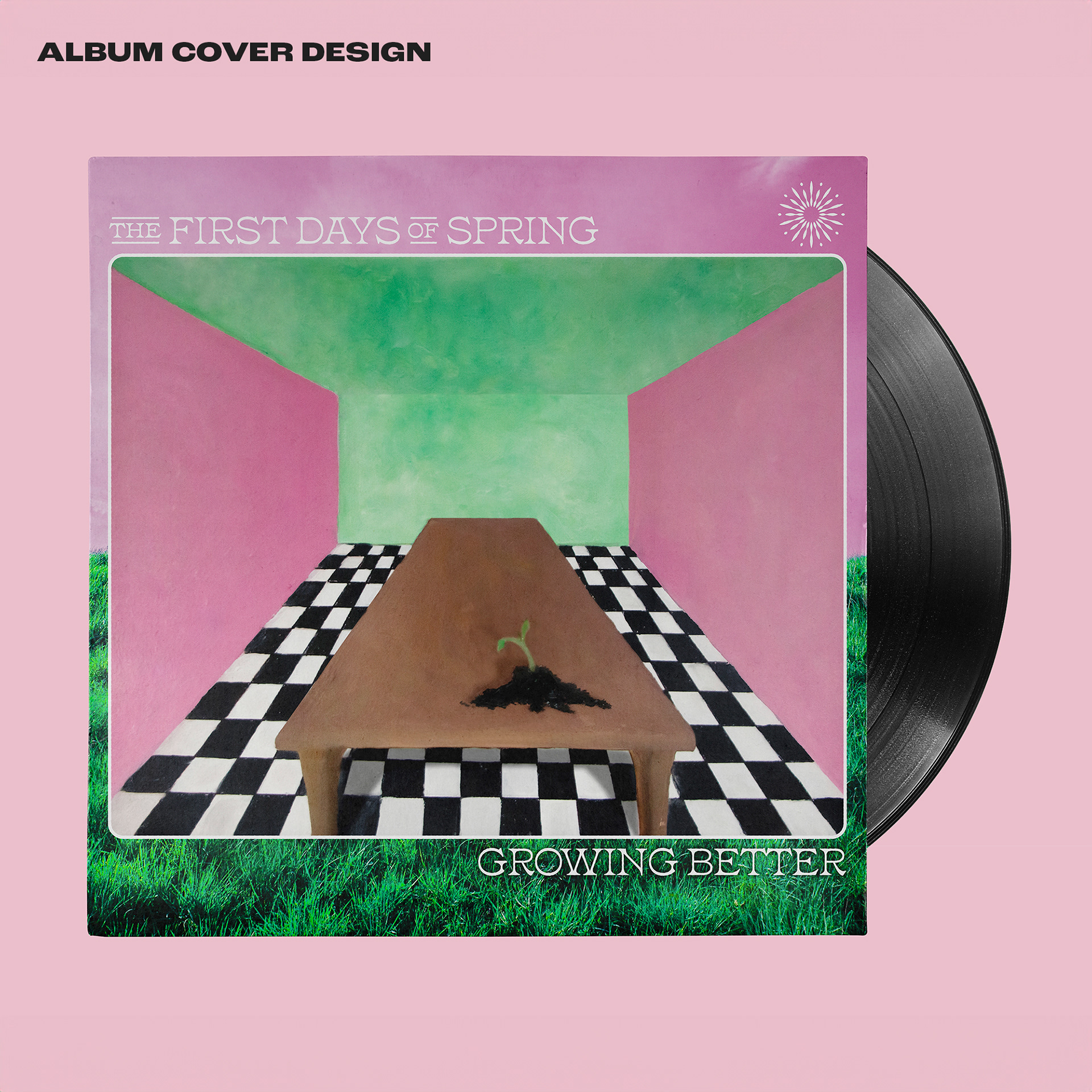
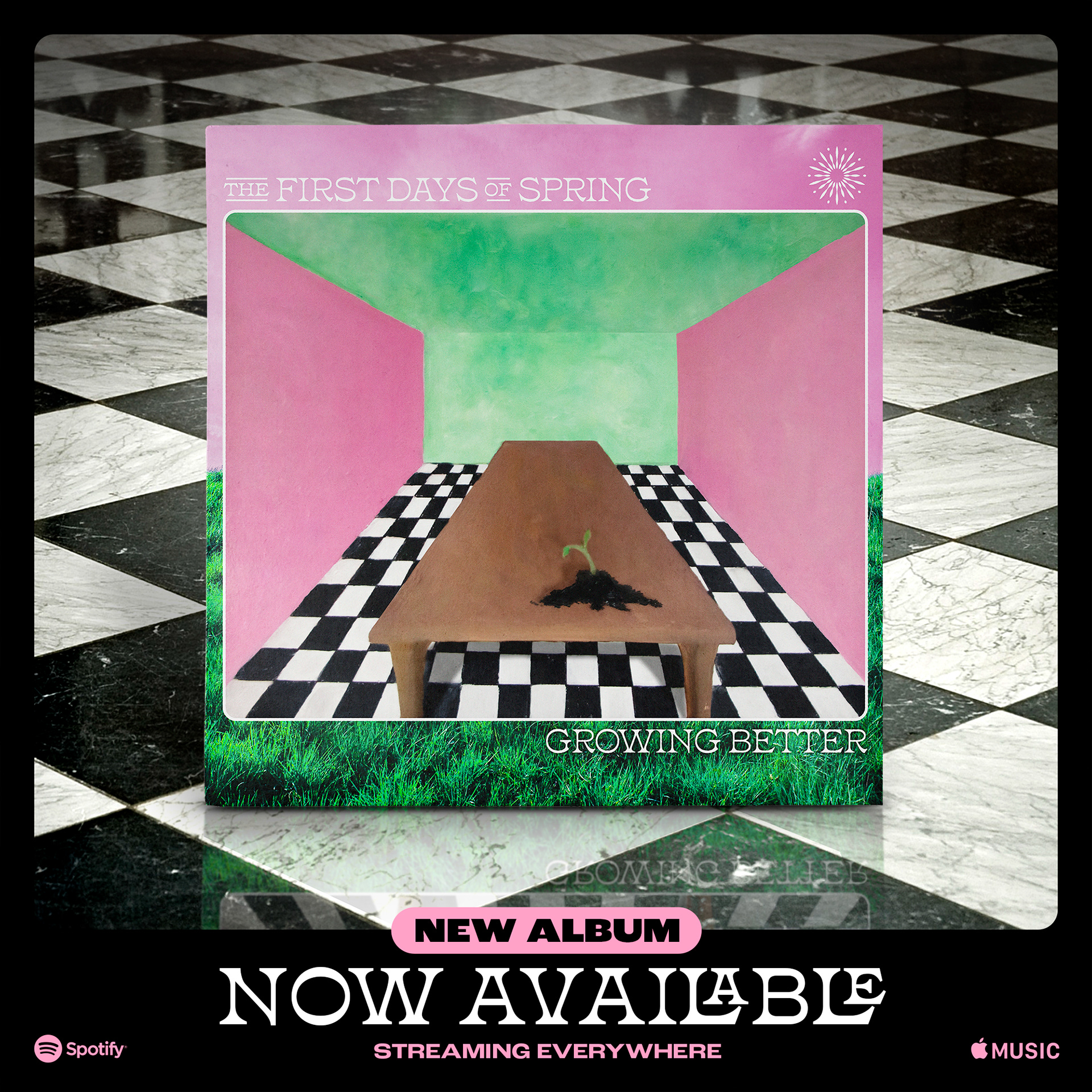
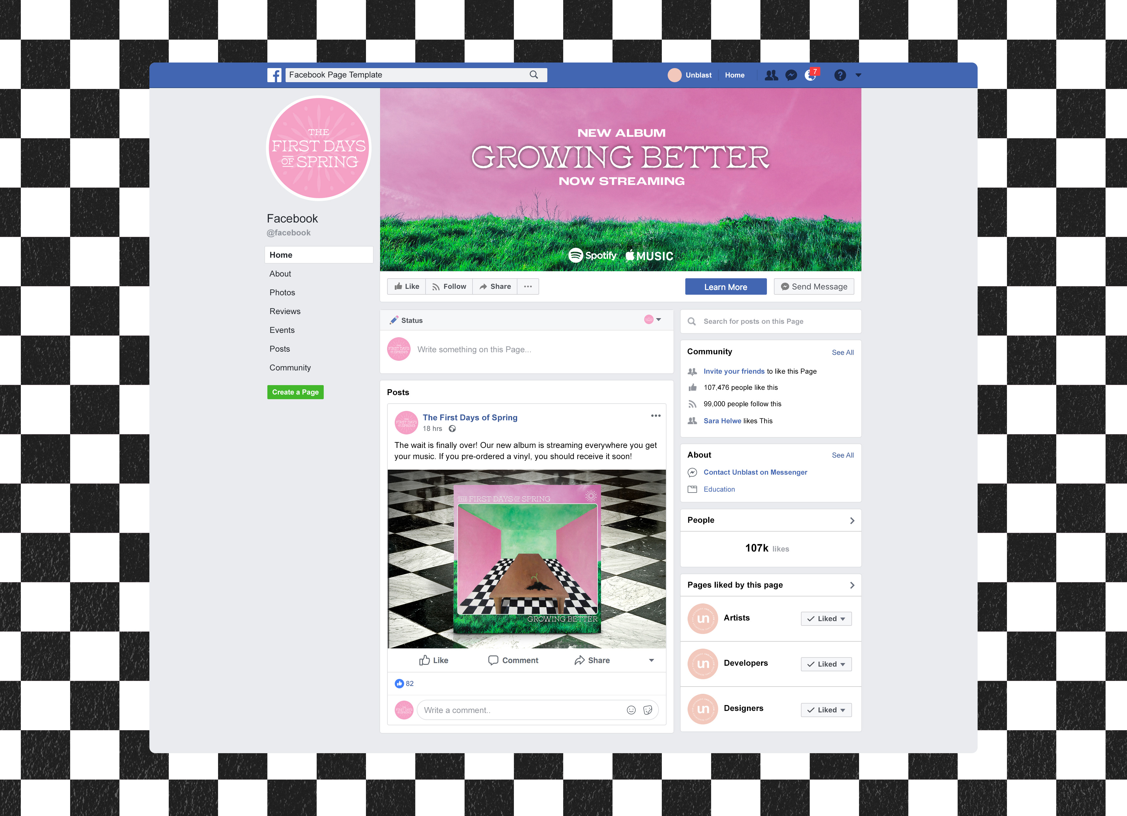
For their very first album launch, The First Days of Spring had commissioned two original paintings be made by local artist Lisa Kay. The band wanted to use one of the paintings as the single artwork, and the other as the full album artwork. After receiving the original oil paintings, I photographed them on a tripod and then edited them to best work on the final album art files. They required a bit of color correction, edits to contrast, depth, etc. All subtle enough edits to maintain the integrity of the original paintings. Then after establishing a logo and type treatment for the launch that worked well with the imagery, the album covers were designed. In the full album art, some new elements were brought in to help embellish the art work. The bright green grass, pink sky, and checked tile were then used as branding elements in the ads, social branding, and other deliverables. Prior to the release, a lyric visualizer was needed for the Casualties single. This was done by adding psychedelic effects to the artwork and having the lyrics appear overtop in the same font used for the launch branding. A snippet is included below.
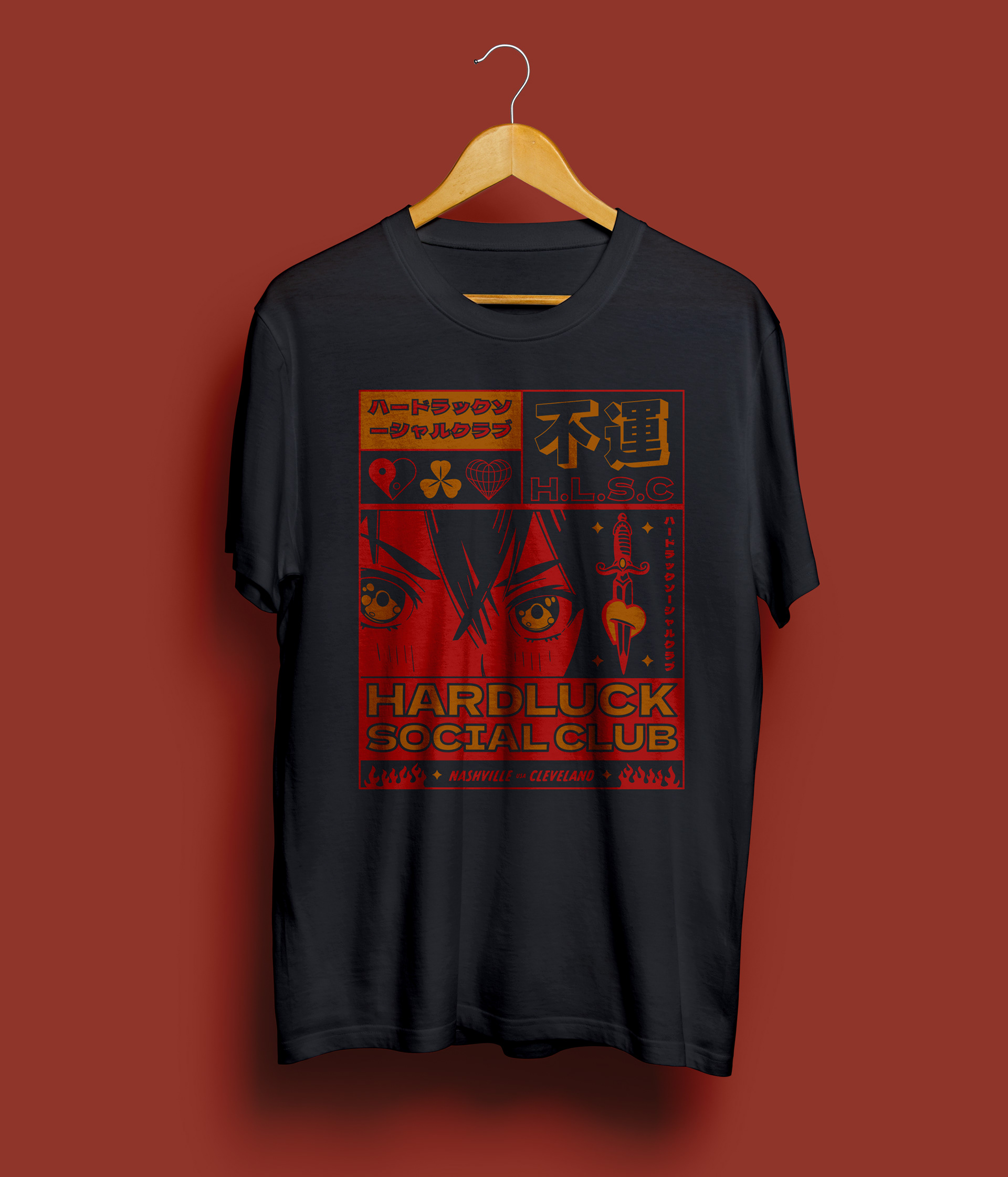
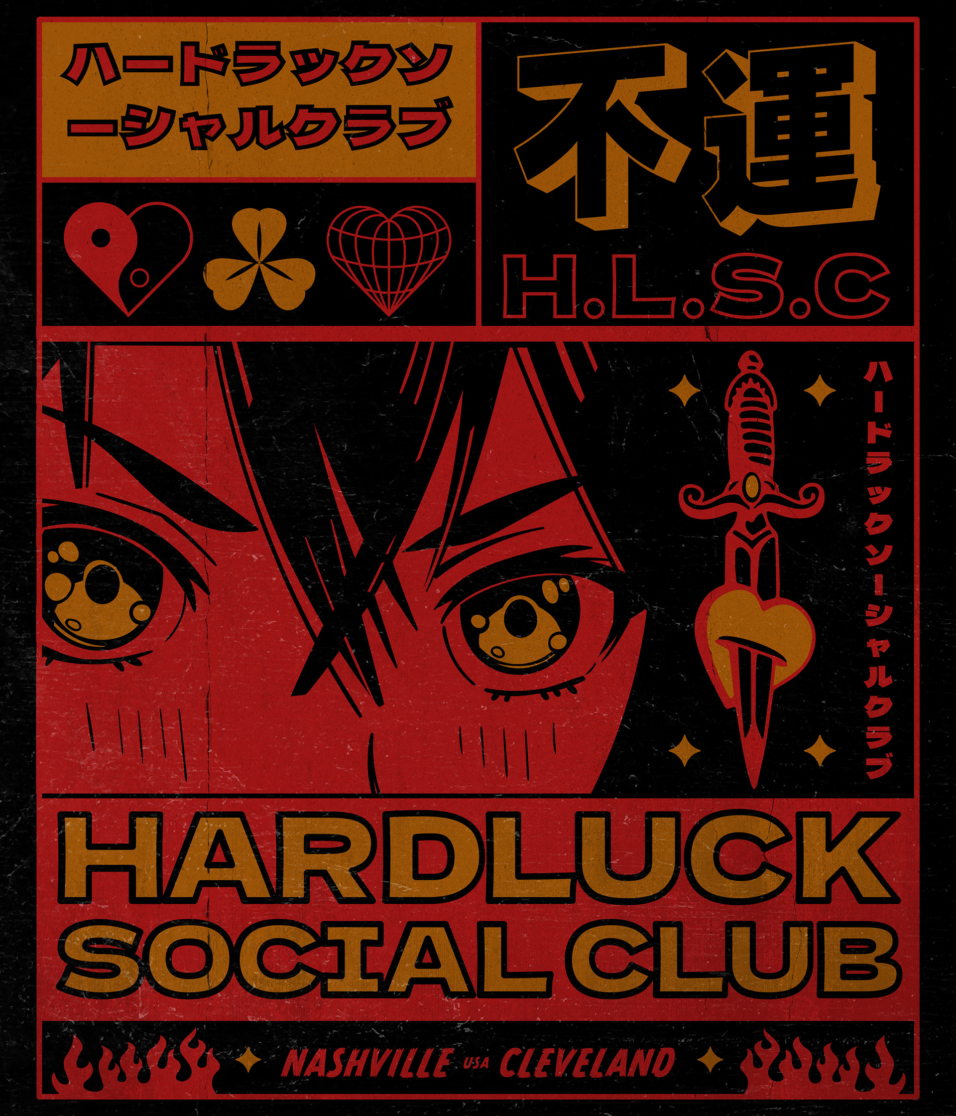
Hard Luck Social Club: Merch & Logo
For their first round of merch designs, Hard Luck Social Club wanted something to represent their band's over all style. The idea was to work in a Manga/Anime style while conveying emotion, struggle and heart-ache. This design was achieved with a large panel style graphic that used Japanese characters, symbols of luck, and a heart with a dagger through it that would ultimately become a logo of sort that could be applied to stickers, social media profile images and other apparel.

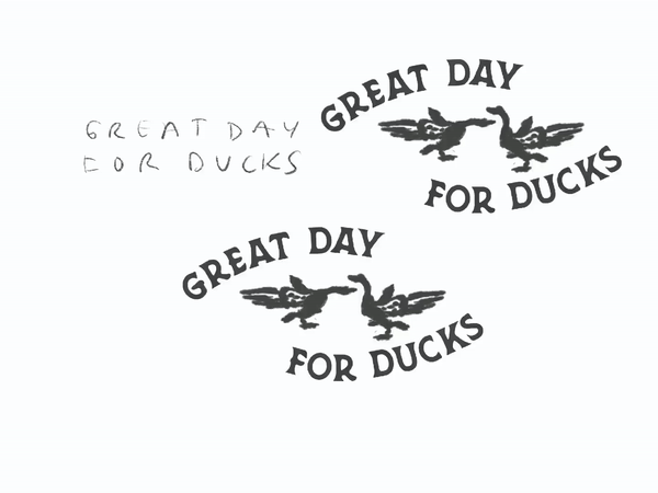
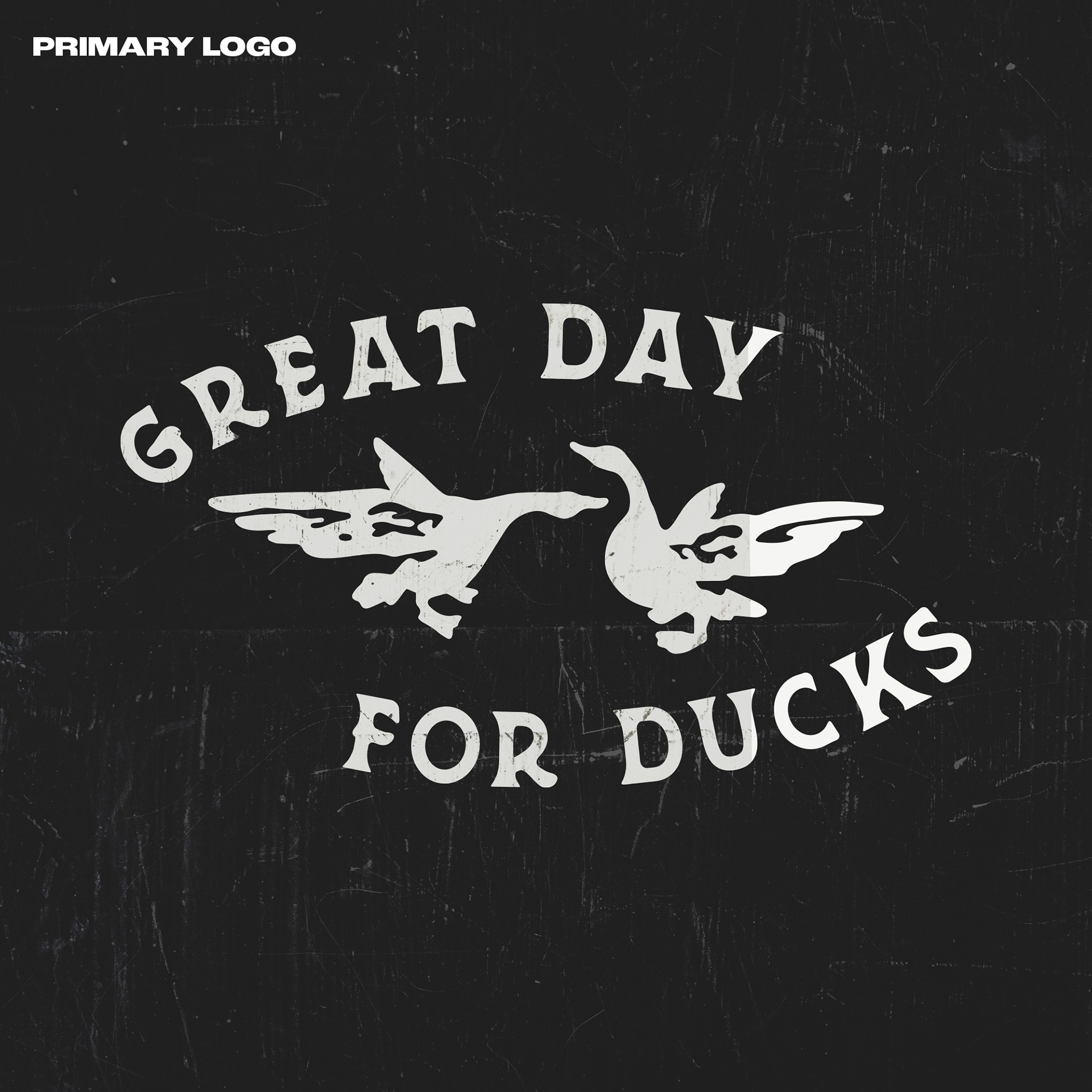
Great Day for Ducks: Now You're Older Launch
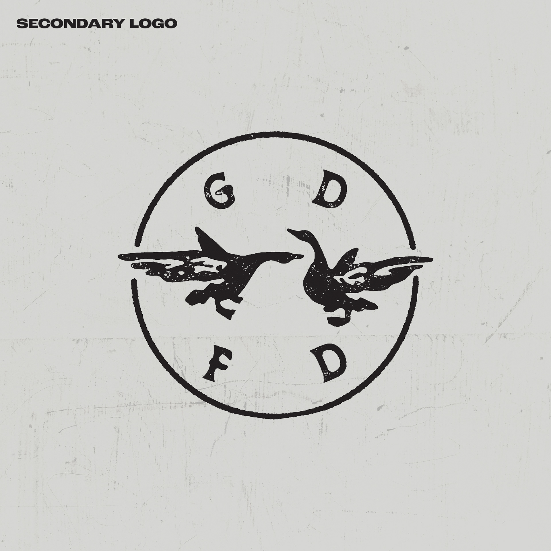
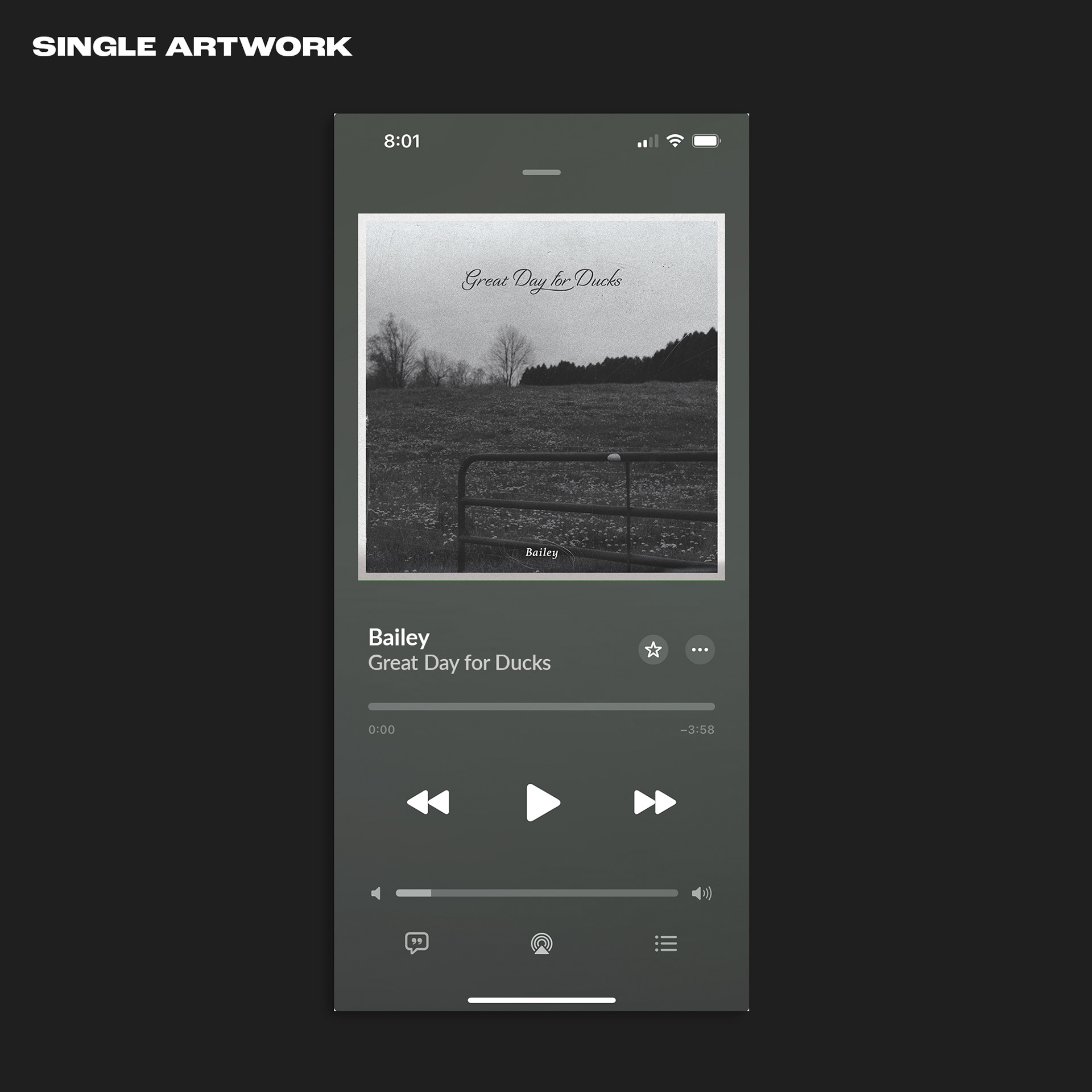
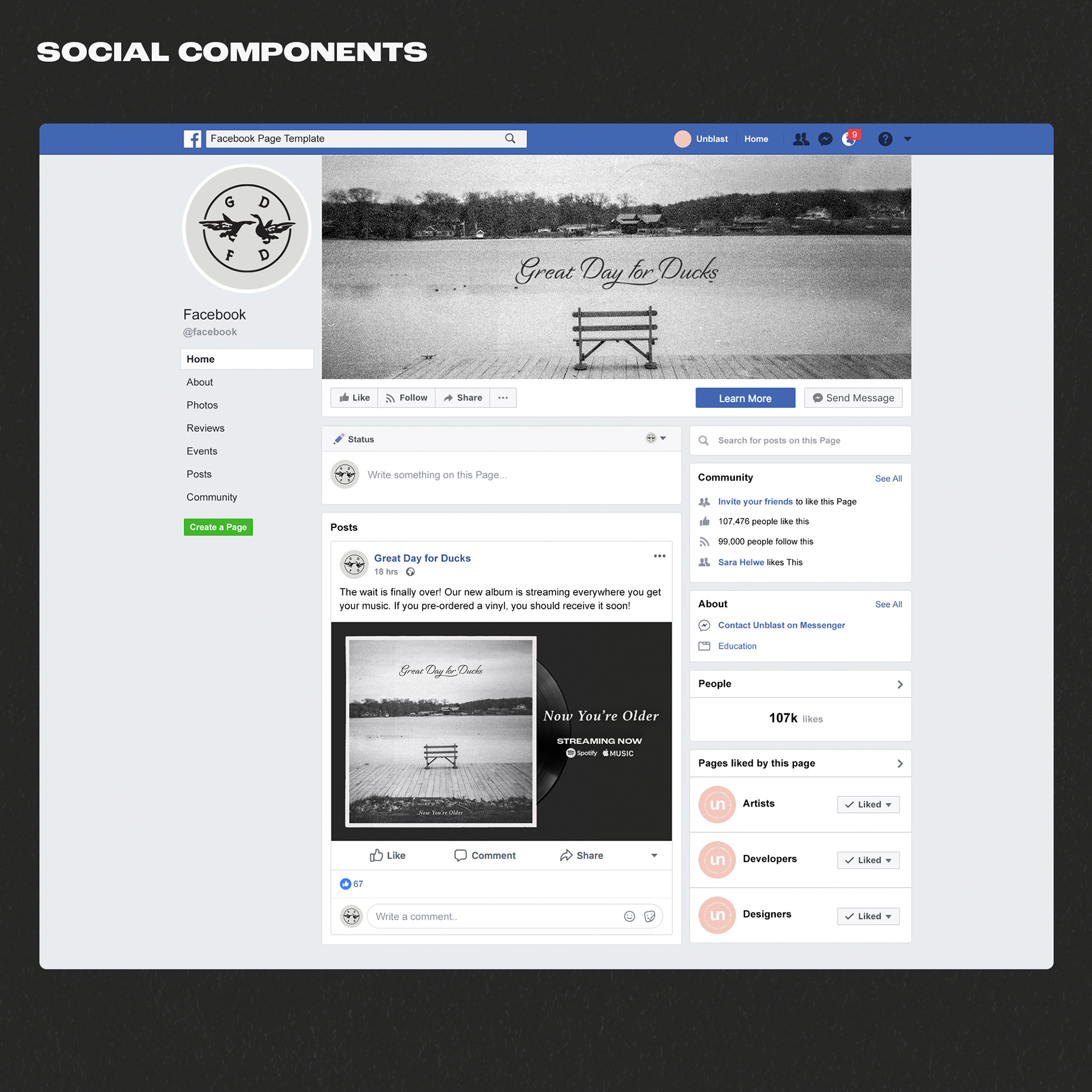
For their first album launch, Great Day for Ducks was in need of a band logo, some single art and album art, and social media components to announce the release. The logo is representative of the two founding members and can be structured a variety of ways. Original photos for album art and single art were provided and then edited to fit the tone of the album campaign. Set in neutral tones. Upon release of the single, "Bailey", it was accompanied be a lyric video with slight video edits and color matching.


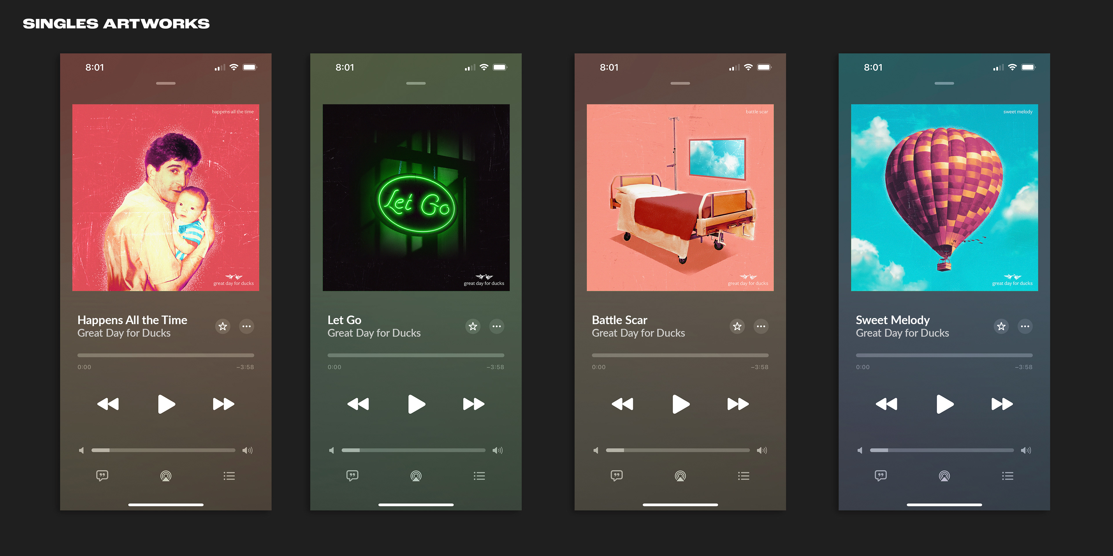
Great Day for Ducks: 2023–24 Singles & Poster
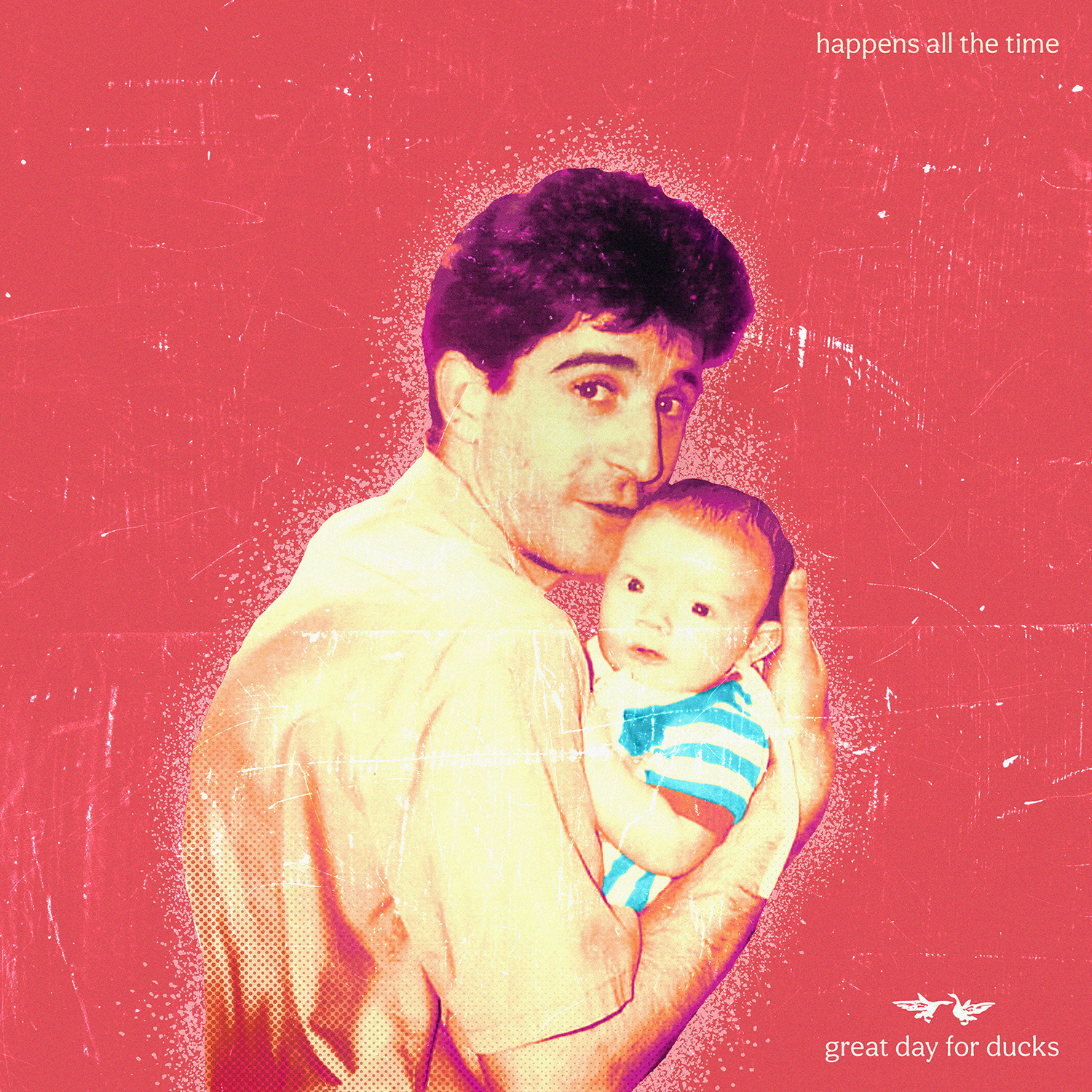
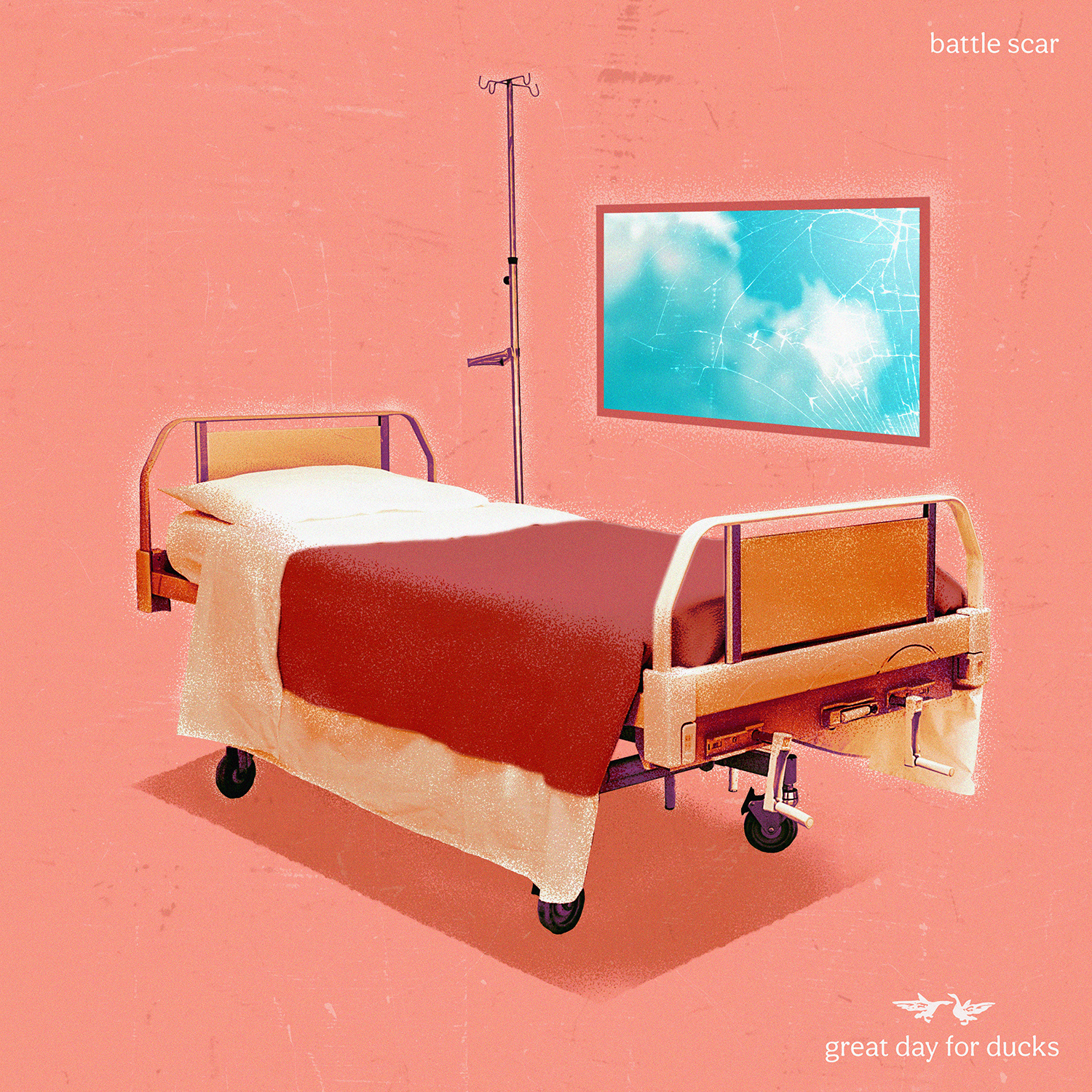
For the bands second round of song releases, they to have four separate drops, each with a different artwork related to the subject matter of the particular track. Each album was designed with a photography element at its core and then edited to fit the right tone and illustrated overtop of in order to create a unique feel. All four of the singles are meant to have a cohesive style, tone, and thematic approach.
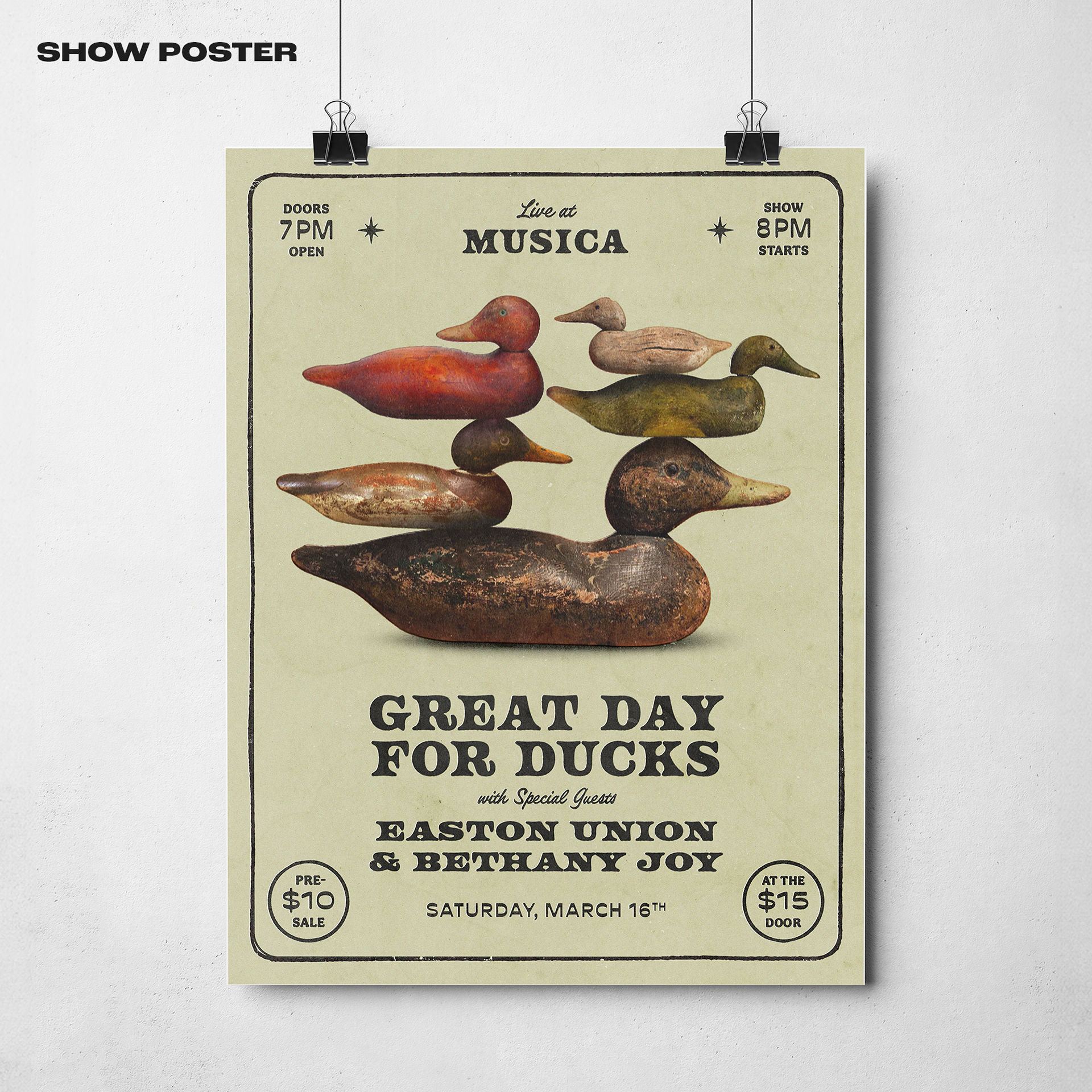
The poster design was themed around decoy ducks stacked irrationally and artistically in a similar tone that matched the singles' art.
The poster design was themed around decoy ducks stacked irrationally and artistically in a similar tone that matched the singles' art.